off the charts
POLICY INSIGHT
BEYOND THE NUMBERS
BEYOND THE NUMBERS
Our Big-Picture Look at Inequality
“The broad facts of income inequality over the past six decades are easily summarized,” our newly updated Guide to Statistics on Historical Trends in Income Inequality explains:
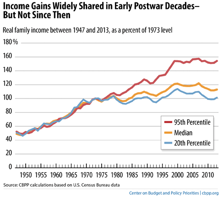
- The years from the end of World War II into the 1970s were ones of substantial economic growth and broadly shared prosperity.
- Incomes grew rapidly and at roughly the same rate up and down the income ladder, roughly doubling in inflation-adjusted terms between the late 1940s and early 1970s.
- The income gap between those high up the income ladder and those on the middle and lower rungs — while substantial — did not change much during this period.
- Beginning in the 1970s, economic growth slowed and the income gap widened.
- Income growth for households in the middle and lower parts of the distribution slowed sharply, while incomes at the top continued to grow strongly. (See first graph below.)
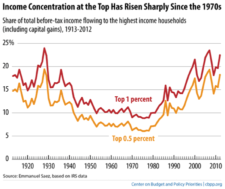
- The concentration of income at the very top of the distribution rose to levels last seen more than 80 years ago, during the “Roaring Twenties.” (See second graph below.)
- Wealth — the value of a household’s property and financial assets, minus the value of its debts — is much more highly concentrated than income. The best survey data show that the top 3 percent of the distribution hold over half of all wealth. Other research suggests that most of that is held by an even smaller percentage at the very top, whose share has been rising over the last three decades.
The guide describes common sources of income data and discusses their relative strengths and limitations in understanding income and inequality trends. It also highlights the trends that those key data sources show and gives additional information on wealth (which helps measure how the richest Americans are doing) and poverty (which measures how the poorest Americans are doing).
Image
Image
Topics:

CBPP
Receive the latest news and reports from the Center