Chart Book: The War on Poverty at 50, Section 1
More Complete Poverty and Income Measures Show Progress Over the Last 50 Years
The following charts illustrate that:
- An expanded poverty measure shows progress that the official measure masks (Part I);
- Elderly poverty has fallen substantially under any measure (Part II);
- The safety net reduces child poverty substantially (Part III);
- Incomes rose at the bottom (Part IV); and
- Incomes grew among poorest African Americans and whites, but large disparities remain (Part V).
Part I: Expanded Poverty Measure Shows Progress That Official Measure Masks
Poverty has fallen significantly since 1967 among the population as a whole and among children and seniors, according to new research using a more complete measure of poverty.
The research, from a team at Columbia University, is the first to apply a version of the federal government’s new Supplemental Poverty Measure (SPM) — which most researchers and analysts favor over the “official” poverty measure — to years before 2009. Unlike the official measure, which counts only a family’s cash income, the SPM also counts non-cash benefits such as rent subsidies, tax credits, and nutrition assistance, and subtracts various expenses, such as income and payroll taxes, child care costs, and out-of-pocket medical expenses.
Since non-cash and tax-based benefits now constitute a much larger part of the safety net than 50 years ago, the official poverty measure’s exclusion of these benefits masks progress in reducing poverty. Trying to compare poverty in the 1960s to poverty today using the official measure yields misleading results; it implies that programs like SNAP (formerly food stamps), the Earned Income Tax Credit (EITC), and rental vouchers — all of which were either small in the 1960s or didn’t yet exist — have no effect in reducing poverty, which clearly is not the case.
To determine whether the share of the population that is poor by today’s living standards has grown or shrunk since the late 1960s, the Columbia University researchers developed a version of the SPM called the “anchored SPM.” This measure takes the 2012 SPM poverty line (which is based on current consumption patterns for a set of necessities like food, clothing, and shelter) and adjusts it back to 1967 (the first year for which such estimates were possible) to remove the effects of inflation.
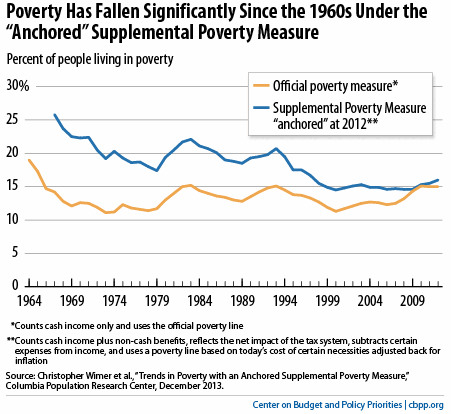
Under the anchored SPM, the poverty rate fell from 26 percent to 16 percent over this period, meaning that a significantly smaller share of the population today has difficulty affording what we now consider “the basics” (see the first chart).
Under the official poverty measure, by contrast, poverty fell only modestly between 1964 and 2012 and was slightly higher in 2012 than in 1967. In addition to missing non-cash benefits and tax credits, the official measure uses a poverty line — the income level below which a person is considered poor — that was set in the 1950s and updated thereafter only for inflation, with no adjustment for changes in living standards.
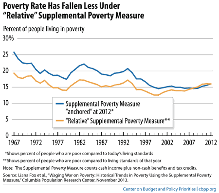
The Columbia researchers have also released a different version of the SPM, a relative SPM, which shows whether the percentage of the population that is poor by living standards of the time has grown or shrunk since the late 1960s. This relative SPM sets the poverty line each year based on consumption patterns for basic needs over the preceding five-year period. (This is the updating procedure that the federal government uses each year for its SPM figures and is closely based on poverty measurement recommendations from independent experts at the National Academy of Sciences.) Under this measure, the SPM poverty line itself rises a bit faster than inflation in most years and, thus, is higher in inflation-adjusted terms in 2012 than in 1964.
Under this measure, the improvement in poverty was far more modest, as the next chart shows. The poverty rate fell from 19 percent in 1967 to 16.0 percent in 2012, meaning that the share of the population with difficulty affording what were considered “the basics” of the day shrank only modestly. This reflects the fact that living standards change over time, and what are considered to be “the basics” today reflect a somewhat better or more modern standard of living than what were considered to be the basics in the 1960s.
As these differing trends make clear, there is no single answer to the question of how poverty has changed over the last 50 years. It is difficult to track a measure such as poverty over a very long period of time because so many aspects of society — such as living standards, family size and structure, and technology — change significantly over the course of decades. To cite just one example, the official poverty line was created based on 1950s spending patterns, when many people lacked phone service and the Internet didn’t exist.
Comparisons using either version of the Supplemental Poverty Measure, while not perfect, provide a more accurate picture than comparisons that use the official poverty measure, which counts the key form of government assistance that has shrunk since the late 1960s — cash welfare assistance — while failing to count the forms of means-tested assistance that have grown substantially, such as food and rental assistance and work-based tax credits.
Part II: Elderly Poverty Has Fallen Substantially Under Any Measure
Under the anchored SPM, the poverty rate for people aged 65 and over fell from 47 percent to 15 percent between 1967 and 2012. Under the official poverty measure (which counts Social Security benefits as income, as those benefits are provided in cash), it fell from 30 percent to 9 percent over that period. These gains reflect, in large part, the fact that over this period, a growing share of seniors was covered by Social Security and benefits became more adequate.
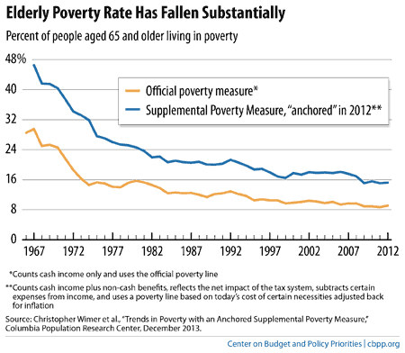
The anchored SPM consistently shows higher poverty rates for seniors than does the official measure, even though the SPM includes non-cash benefits such as SNAP that help many seniors. This is largely because the SPM subtracts out-of-pocket medical expenses, which leave seniors with fewer resources to afford other necessities like food and shelter, from family income before comparing that income to the poverty line. The SPM also eliminates a feature of the official poverty measure that sets a lower poverty line for elderly households than for other households of the same size.
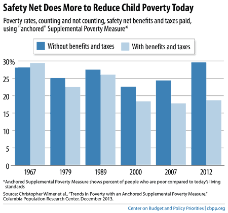
Part III: Safety Net Reduces Child Poverty Substantially
Data from the Columbia researchers show that between 1967 and 2012, the child poverty rate under the anchored SPM fell from 29 percent in 1967 to 19 percent in 2012, a large reduction. A key reason was that the safety net became increasingly effective at lifting children out of poverty.
One way to measure how assistance programs affect poverty is to compare poverty rates using two measures of income: 1) a “pre-transfer” measure, which reflects a household’s cash income excluding all government benefits (both cash and non-cash) and ignoring taxes paid; and 2) the regular SPM income measure, which is a “post-tax, post-transfer” measure that reflects a family’s income after government benefits (cash and non-cash), as well as the net effect of the tax system (including income and payroll taxes paid and receipt of tax benefits such as the EITC), are taken into account.
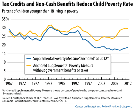
The next chart shows the share of children in poverty using these two measures, both based on the anchored SPM described above. Under the “pre-transfer” measure, child poverty rose slightly between 1967 and 2012 (though it was lower in 2007, before the Great Recession, than in 1967). But under the “post-tax, post-transfer” measure that includes government benefits and taxes, child poverty fell significantly.
The chart also shows that public benefits were very effective in preventing a substantial increase in child poverty during the Great Recession and its aftermath. The child poverty rate would have risen substantially between 2007 and 2012 if one only looks at pre-transfer income, but remained relatively flat under the broader income measure.
The next chart shows how much more the safety net does to reduce child poverty today than it did five decades ago. In 1967, the safety net did very little to reduce child poverty — in fact, the net effect of adding government benefits and subtracting taxes paid was to increase rather than decrease poverty.
The story in 2007, before the Great Recession, was very different: the safety net cut child poverty from 24 percent of children to 18 percent. In 2012, it did even more, shrinking child poverty from 30 percent to 19 percent.
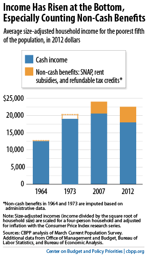
Part IV: Incomes Rose at the Bottom
The average income of the bottom fifth of households, when non-cash and tax-based benefits are included, rose by more than 75 percent between 1964 and 2012, after adjusting for inflation and the significant decline in household size over this period. Both earnings and government assistance contributed substantially to this growth.
The bottom fifth of households generally encompasses poor families and some people modestly above the poverty line.
If we measure from 1973 rather than from 1964, income growth for the bottom fifth has been less dramatic but still notable; the bottom fifth’s average income increased 18 percent between 1973 and 2007, years that are comparable because both were peaks of a business cycle. Incomes fell among the poorest fifth of households during the Great Recession, though increased non-cash benefits and unemployment benefits helped buffer the loss.
The next chart highlights the growing importance of non-cash and tax-based benefits such as SNAP and the EITC. If one counts only households’ cash income (including government cash benefits such as Social Security) but excludes non-cash and tax-based benefits such as SNAP and the EITC, the purchasing power of low-income households was lower in 2012 — when incomes remained depressed because of the recession — than in 1973. But when the non-cash and tax-based benefits are counted, the decline turns into a modest improvement.
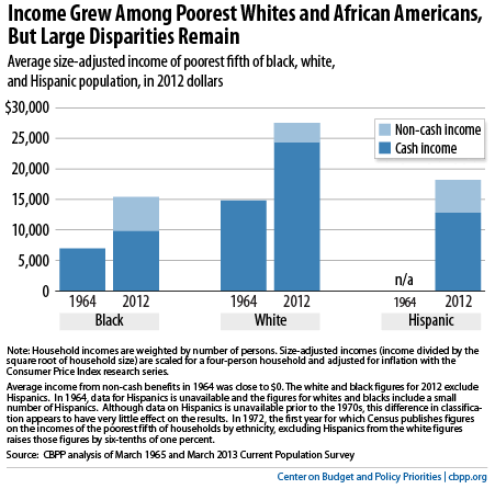
Part V: Incomes Grew Among Poorest African Americans and Whites, But Large Disparities Remain
Average cash incomes for the poorest fifth of African-American households rose by 41 percent between 1964 and 2012, from just under $7,000 to $9,800. (As above, these figures adjust for inflation and the decline in household size over this period.) Non-cash and tax-based benefits further boosted average incomes of this group; when they are taken into account, average income among these families rose by 122 percent — or more than doubled — over this period. Nevertheless, the bottom fifth of African-American households continue to have very low incomes.
The poorest fifth of white households saw their cash incomes rise by a somewhat greater amount — 64 percent — over the 1964-2012 period, from $14,800 to $24,300, and they also benefited from increases in non-cash and tax-based benefits. Their total income including the non-cash and tax-based benefits rose by 86 percent. While this is a smaller percentage increase than African American households secured, the average income of the poorest fifth of white households rose by more in dollar terms than did that of African-American households.
The larger dollar, but smaller percentage, increase among white households reflects the stark differences in the incomes of the two groups in 1964, when the average income of the bottom fifth of African-American households, at about $7,000, was just under half the average income of the bottom fifth of white households. Between 1964 and 2012, this disparity narrowed in percentage terms while growing further in actual dollars. Today, the average income of the poorest fifth of African American households is $12,000 less than the average income of the poorest fifth of white households, a large gap.
More from the Authors

Areas of Expertise

Areas of Expertise