BEYOND THE NUMBERS
“Gini Index” From Census Confirms Rising Inequality Over Four Decades
As our statement on Tuesday’s Census Bureau report notes, a key measure of inequality known as the Gini index was tied for its highest level on record in 2012, further evidence of worsening inequality.
Census says, “The Gini index was 0.477 in 2012, not statistically different from 2011.” But, it goes on to say, “Since 1993, the earliest year available for comparable measures of income inequality [because of a change in the way Census computes the number], the Gini index has increased 5.2 percent.” (See graph.)
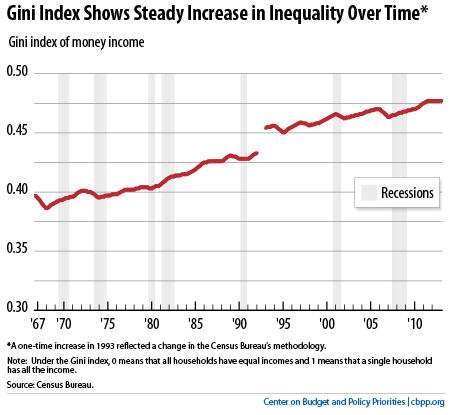
Under the Gini index, zero represents perfect income equality (all households have equal incomes) and 1 represents perfect inequality (one plutocrat has all the income). The index has risen in almost every year since 1993, even though its rise in most single years hasn’t been statistically significant. In fact, the rise began well before 1993, as the graph shows.
When it comes to inequality, the trend is clear. The United States experienced strong economic growth and shared prosperity for the immediate post-World War II generation, followed by slower growth and widening inequality since the 1970s. And our tax code and government benefit programs do less to offset inequality than many other countries’.
These facts help explain why we should preserve and improve the safety net and adopt a balanced approach to deficit reduction that includes significant revenues.