Chart Book: Top Eleven Tax Charts
To usher in Tax Day, here are our top 11 charts on federal taxes, which provide context for debates on issues like tax reform and deficit reduction.
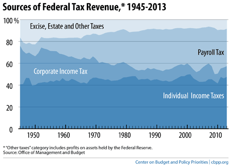
Our first chart shows the sources of federal tax revenue.
Individual income tax revenues have held steady for many decades at a little under half of federal revenue. The share of federal revenue from payroll taxes (mostly Social Security and Medicare taxes) grew sharply between the 1950s and 1980s and has since remained relatively stable. Conversely, the share of federal revenue from corporate taxes fell sharply between the 1950s and 1980s and has remained at this lower level.
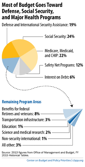
Our second graph reminds us what those taxes pay for.
Social Security, major health programs like Medicare and Medicaid, and national defense account for roughly two-thirds of federal spending. Safety net programs (such as unemployment insurance and nutrition programs) and interest on the debt account for 12 percent and 6 percent of federal spending, respectively. The remaining 18 percent goes to such other areas as roads, education, and health and science research.
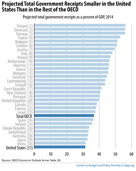
The United States is a relatively low-tax country, as the chart below shows. When measured as a share of the economy, total government receipts (a broad measure of revenue) are lower in the United States than in any other member of the Organisation for Economic Co-operation and Development (OECD), even after accounting for the modest revenue increases in the 2012 “fiscal cliff” deal and the taxes that fund health reform.
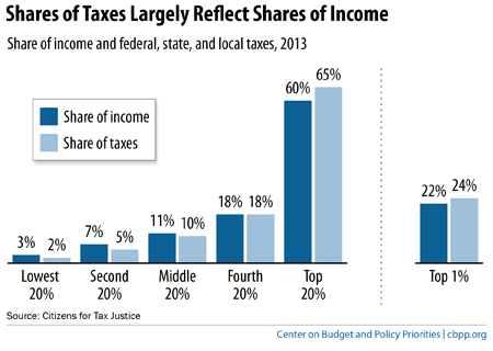
While high-income filers pay a large share of the nation’s taxes, the main reason is that they receive a large share of the nation’s income. Moreover, focusing solely on the income tax — among the most progressive taxes — gives a distorted picture of the full set of taxes that different income groups pay.
The chart below provides a more complete picture. It shows the share of all federal, state, and local taxes that each income group pays and what share of the nation’s income it collects. As the graph shows, incomes in the United States are extremely polarized, and the overall tax system is only modestly progressive. For example, the top 1 percent of earners received 22 percent of the nation’s income in 2013 and paid 24 percent of all taxes; the bottom 60 percent of people received 21 percent of the income and paid 17 percent of the taxes.
This largely reflects the fact that average tax rates increase modestly as you move up the income scale. On average, the bottom 20 percent pays 19 percent of their income in taxes; the middle 20 percent pays 27 percent, and the top 20 percent pays 32 percent, according to Citizens for Tax Justice.
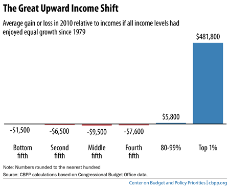
Policymakers considering tax policy changes should keep the economic context in mind, including the dramatic increase in inequality in recent decades. Congressional Budget Office data show that incomes grew at much faster rates for high-income people than for everyone else between 1979 and 2010 (the most recent year available).
As the chart below shows, the average middle-income family had $9,500 less after-tax income in 2010, and the average household in the top 1 percent had $481,800 more, than if all groups’ incomes had grown at the same rate since 1979.
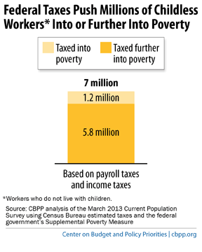
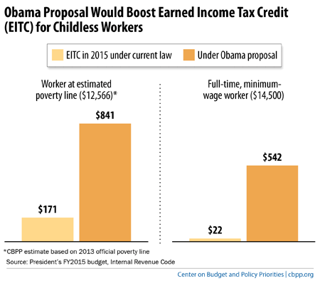
Many low-wage workers struggle to climb the economic ladder, particularly workers who are not raising minor children — the sole group that the federal tax code taxes into (and deeper into) poverty, as the chart below shows. Often called “childless workers” — though many are non-custodial parents who have financial obligations to their children and play an important role in their lives — they pay substantial payroll taxes and begin paying income taxes while earning less than the poverty line (about $12,000 for a single worker). The Earned Income Tax Credit (EITC) for these workers is far too small to offset their income and payroll tax liabilities.
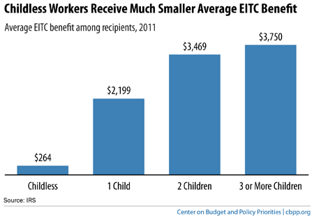
The average childless worker who receives the EITC gets just $264, a small fraction of the EITC that other low-wage workers receive, as the chart below shows. Moreover, childless workers under age 25 are ineligible for the EITC.
There are recent signs of bipartisan momentum to provide a meaningful EITC for childless workers. President Obama as well as key House and Senate members have advanced proposals that would take a major step forward. As the chart below shows, the EITC for a childless worker making poverty-level wages would rise from $171 to $841 under the President’s plan. Moreover, the Treasury Department estimates that the President’s proposal would lift about half a million people out of poverty and reduce the depth of poverty for about another 10 million, under a poverty measure that includes the cash value of tax credits and benefit programs. The congressional proposals are larger, and so would likely have larger anti-poverty effects.
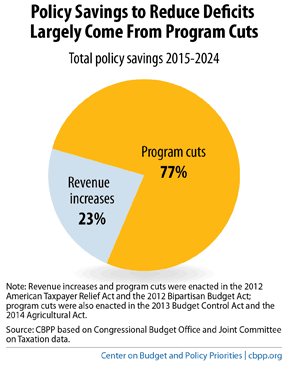
Recent deficit-reduction measures, including the 2011 Budget Control Act’s funding caps and automatic cuts under sequestration, have been heavily tilted to spending cuts, rather than revenue increases.
If sequestration remains in place, 77 percent of the deficit reduction over 2015-2024 resulting from policy changes will come from spending cuts. Just 23 percent will come from increased revenues, as the chart below shows.
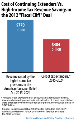
Policymakers agreed on a bipartisan basis last December to offset the cost of partially lifting sequestration for 2014 and 2015.
By contrast, however, the Senate Finance Committee has approved a package of “tax extenders” (expiring tax breaks, mostly for corporations) without offsetting the cost. If continued for the next decade without offsets, the extenders would cost $484 billion. That’s the equivalent of giving back more than half of the revenue savings from the 2012 “fiscal cliff” deal, which raised tax rates on very high-income taxpayers, as the chart below shows. And if policymakers also continue the “bonus depreciation” tax for businesses — mistakenly in our view — the ten-year cost rises to $747 billion, wiping out nearly all of the fiscal-cliff savings.
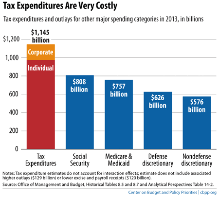
Policymakers can reduce the deficit or finance investments by scaling back costly and inefficient “tax expenditures,” or spending delivered through the tax code in the form of tax credits, deductions and exclusions.
For example, House Ways and Means Chairman Dave Camp’s recent tax reform plan outlined dozens of specific cuts in tax subsidies.
As the chart below shows, tax expenditures cost well more than Social Security and also than Medicare and Medicaid combined. Harvard economist Martin Feldstein, former chair of President Reagan’s Council of Economic Advisers, has said that “cutting tax expenditures is really the best way to reduce government spending.”